How to Read the statpx Analytics Dashboard: A Complete Guide to Every Section
Having analytics data is only useful if you understand what you are looking at. The statpx dashboard is laid out in a deliberate order — the most important numbers at the top, then progressively more detailed breakdowns below. This guide explains every section, what each metric means, and what it tells you about your visitors.
If you have not installed the tracking snippet yet, start with our guide on how to install the statpx tracking code. Data must be flowing before the dashboard sections shown here will contain meaningful information.
The Summary Cards
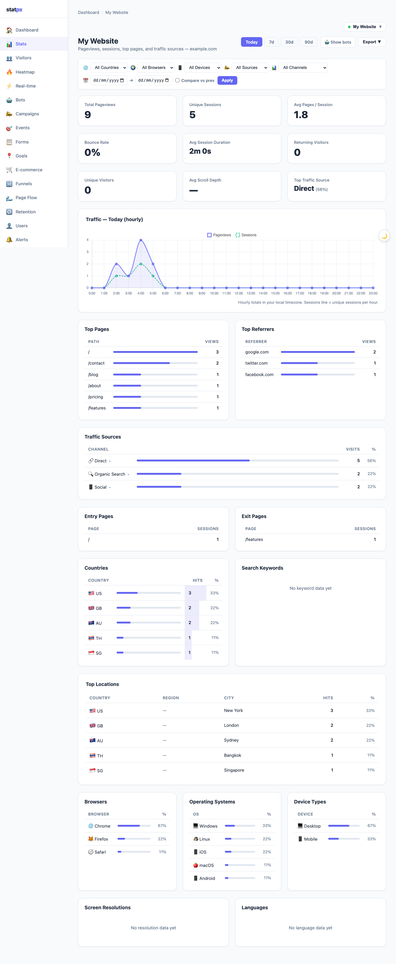
At the very top of the stats page, four summary cards give you an immediate snapshot of your site's performance for the selected time period.
Below the four cards, a Top Traffic Source label tells you which channel is sending the most visitors in the selected range — Organic, Direct, Referral, Social, Email, or Campaign. This single line is often the most immediately actionable piece of data on the whole page.
The Traffic Chart
The chart below the summary cards visualises traffic over time. It shows two data series: Pageviews (rendered as a filled area) and Sessions (rendered as a line on top). Seeing both at once makes it easy to spot when traffic volume grew because more visitors came versus when it grew because existing visitors browsed more pages.
The chart's time resolution changes automatically based on the selected date range:
- Today — hourly bars. You can see exactly which hours of the day generate the most traffic.
- 7d / 30d — one bar per day. Good for spotting weekly patterns and the impact of specific content or campaigns.
- 90d — one bar per day across three months. Use this to identify long-term trends, seasonality, or the effect of major site changes.
Click the range tabs (Today / 7d / 30d / 90d) at the top right of the chart to switch. The default is always Today, which means the numbers in all sections refresh to show only traffic from the current day. This is intentional — the most useful thing to check first is what is happening right now, not an average of the past month.
Top Pages and Top Referrers
Beneath the chart, two tables sit side by side. These are among the most actionable sections in the dashboard.
Top Pages
This table lists the URLs that received the most pageviews in the selected period, sorted from highest to lowest. Use it to identify your best-performing content. If a blog post or product page is consistently near the top, it is worth investing in — add more internal links to it, keep it updated, and consider creating related content. If a page you care about is not appearing, that tells you it is not getting traffic and needs attention (better internal linking, SEO work, or promotion).
Top Referrers
Referrers are the external websites that sent visitors to your site by linking to it. statpx strips tracking parameters and shows clean domain names — so twitter.com rather than a full tweet URL with session tokens. A referrer you do not recognise is worth investigating: it might be an unexpected mention, a forum discussion, or a site that linked to you without you knowing. For more detail on how referral traffic works, see our guide on what is referral traffic and how to increase it.
Traffic Sources Breakdown
statpx classifies every session into one of seven source channels:
- Direct — no referrer was detected. Usually typed URLs, bookmarks, or link clicks from apps that do not pass a referrer header.
- Organic Search — the visitor came from a search engine result page (Google, Bing, DuckDuckGo, etc.).
- Referral — a link on another website sent them.
- Social — a link on a social platform (Facebook, LinkedIn, Reddit, etc.).
- Email — detected via a
utm_medium=emailtag or from a known email client referrer. - Campaign — a UTM-tagged URL where
utm_mediumis something other than the above. - Unknown — cannot be classified from the available data.
You can use the channel filter dropdown to isolate one source and see all metrics filtered to just that channel. This is useful when you want to know the bounce rate only for organic visitors, or the top pages only for social traffic.
Countries, Browsers, and Devices
The lower section of the dashboard contains three breakdown tables. Each one gives you a percentage share with colour-intensity bars so you can see the distribution at a glance without reading every number.
The Countries table is particularly useful for content and marketing decisions: if a significant share of your traffic is coming from a country you did not target, that might signal an untapped audience or an opportunity to create localised content. The Browser and Device tables tell you where to focus your testing. If 65% of your visitors use Chrome on mobile, that is the first combination to test whenever you make a design change. If a non-trivial share is on Safari, you need to test there too — Safari's rendering engine differs from Chrome's in meaningful ways.
The Visitor Log
The Visitor Log (accessible via the Visitors link in the site navigation) shows every individual session recorded for your site. Each row contains the session's starting timestamp, country flag, ASN (internet service provider), device type, browser, operating system, and scroll depth — how far down the page the visitor scrolled before leaving.
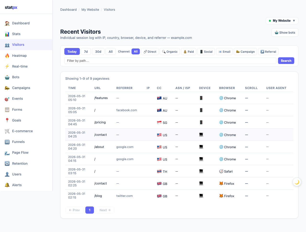
Two coloured badges surface problems automatically. A red 404 badge marks any session where the visitor landed on a page that returned a 404 Not Found response — a direct signal that you have a broken link or missing page to fix. A yellow Bot badge identifies sessions that statpx's bot detection classified as automated traffic rather than a real visitor. These sessions are excluded from your main metrics but remain visible in the log so you can review what is being filtered. For more on how bot detection works, see our guide on bot traffic and how to filter it.
Switching Between Sites and Date Ranges
If you have added multiple sites to your statpx account, use the site picker dropdown at the top of the page to switch between them. Each site has its own completely separate dataset — switching the picker reloads all sections with data for the chosen site only.
The date range tabs (Today / 7d / 30d / 90d) affect every section on the page simultaneously: summary cards, chart, top pages, referrers, countries, browsers, and devices all filter to the same time window. Today is always the default when you first open the stats page — this keeps your day-to-day check-ins fast and focused on what is happening right now rather than what happened on average over the past month.
Start tracking your website for free
statpx gives you privacy-friendly analytics with no cookie banners, no data limits, and no credit card required. Set up takes under 5 minutes.
Get started free →The Bottom Line
The statpx dashboard is designed to answer the most important questions first: how many people visited, where they came from, what they read, and where they are located. The summary cards give you the headline numbers. The chart shows you the shape of traffic over time. The tables tell you which content and channels are working. The visitor log surfaces individual sessions, broken pages, and bot traffic. Once you know what each section is telling you, a quick daily check takes under two minutes and gives you the information you need to make better decisions about your content and marketing.