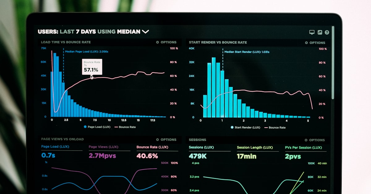
How to Build an Analytics Dashboard That Actually Gets Used
Most analytics dashboards are abandoned within weeks of being built. They start with good intentions — someone pulls together every metric they can think of, arranges them in a grid, and publishes a link. The team checks it a few times, but nobody knows what to conclude from it, so nobody changes their behavior because of it. Within a month, the dashboard is generating data that nobody reads.
A dashboard that gets used is designed around a different premise: not "what can we measure?" but "what decision does this dashboard help someone make?"
Start with the Decision, Not the Data
The most effective way to design a dashboard is to work backwards from the decisions it should inform. Identify the person who will use the dashboard, the decisions they make regularly, and the data that would change how they make those decisions. A dashboard for a content team looks completely different from a dashboard for a marketing team or an operations team — even if both teams have access to the same underlying analytics.
A content team checking which articles drive the most conversions needs top pages by conversion, time on page, and traffic source breakdown. A marketing team managing spend efficiency needs cost per session by channel, conversion rate by source, and week-over-week traffic trends. Build these as separate views, not a single dashboard that tries to serve everyone.
The Three-Metric Rule
Dashboards with more than three "primary" metrics produce paralysis rather than clarity. When everything is a headline, nothing is. The three-metric rule says: choose the three numbers that, if they all looked good simultaneously, would mean your site is performing well this week. Everything else is supporting detail — visible when needed, but not competing for the same cognitive space as your primary metrics.
For a content site, the three primary metrics might be organic sessions, average engagement time, and email signups. For a SaaS landing page, they might be trial signups, pricing page visits, and free-to-paid conversion rate. For an e-commerce site, they might be sessions, add-to-cart rate, and orders. Name your three metrics explicitly before building the dashboard, and make them the largest, most visually prominent elements.
Context Is Not Optional
A metric shown in isolation is almost meaningless. "1,247 sessions this week" tells you nothing actionable. "1,247 sessions — down 18% from last week — below the 30-day average of 1,520" tells you something is wrong and how wrong it is. Every metric on your dashboard needs comparison context — versus the prior period, versus a target, or versus a rolling average — built in by default.
Use the date range comparison features in your analytics tool to surface these deltas automatically. If your dashboard shows raw numbers without trend direction, replace every flat number with a number plus a delta. The delta is usually the signal; the raw number is just context for the delta's scale.
Update Frequency Should Match Decision Frequency
A dashboard that updates hourly but is reviewed weekly is wasting everyone's attention. Match the update frequency to how often someone actually needs to act on the data. Operational dashboards (site is down, traffic spiked, form is broken) need real-time or hourly data. Strategy dashboards (which channel should we invest in next quarter?) need weekly or monthly data.
For most website owners, a weekly review is the right cadence for strategy dashboards: enough data to see real trends, not so much delay that problems compound for a month before you notice them. Pair a weekly dashboard with traffic alerts for the operational layer — the alerts interrupt you when something breaks; the dashboard gives you the regular strategic picture.
Get a dashboard that shows what matters, not everything
statpx keeps your analytics clean and focused — pageviews, sessions, sources, conversions, and alerts in one place, without the noise of a tool trying to do too much.
Start for free →The Bottom Line
A dashboard that gets used has three qualities: it serves a specific decision-maker (not everyone at once), it shows three primary metrics with comparison context (not twenty metrics in a grid), and it updates at the frequency someone actually needs to act on the data. Build your next analytics dashboard starting from the decision it needs to support, and resist the temptation to add "useful" metrics until you are sure the core three are being acted on weekly.