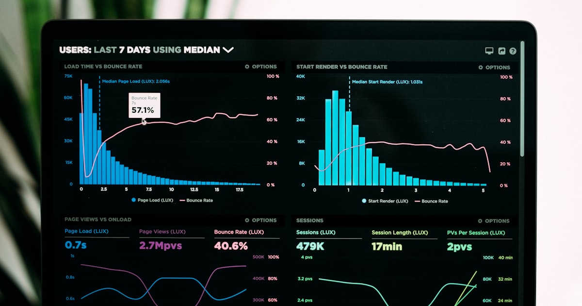
Which Analytics KPIs Actually Belong on Your Dashboard
A dashboard full of metrics isn't an analytics dashboard — it's a data archive with a UI. The value of a dashboard is how quickly it answers the question "is the site performing well right now?" If you need to spend 10 minutes reviewing 20 numbers to answer that question, your dashboard is doing the opposite of its job. Good analytics dashboards show a small number of carefully chosen metrics and make deviations from normal immediately visible.
The criteria for a KPI to earn a permanent dashboard slot: it moves regularly enough to need watching, it has a clear direction (higher or lower is better), and an unusual reading reliably indicates something worth investigating. Metrics that satisfy all three criteria are rare. Here are the ones that typically make the cut.
The Core Five: Valid for Almost Every Site
Daily unique visitors
This is the baseline audience health metric. Not sessions — visitors. Sessions inflate when the same person visits multiple times in a day, making daily visitor count the cleaner measure of how many distinct people your site reached. A sustained decline in daily unique visitors is the single most reliable signal that something is fundamentally wrong — whether SEO, a broken referral source, or a site performance issue. A sustained increase without a corresponding conversion increase is a signal that your content is attracting the wrong audience.
Primary conversion rate
Every site has one action that matters most — a sign-up, a purchase, a contact form submission, a demo request. That action's conversion rate (completions ÷ total sessions or total visitors, depending on which denominator fits your funnel model) should be on your dashboard. Watching this number alongside visitor count tells you whether growth is quality growth. Traffic up 30%, conversion rate flat: you're attracting people who want what you're not offering. Traffic flat, conversion rate up 30%: you've improved something meaningful about the funnel. See how to measure conversion rate accurately before building this metric.
Traffic source breakdown (top 3–4 channels)
Not every referrer — just the top channels as percentages of total: organic search, direct, referral, social, paid. Changes in channel mix often explain unusual traffic patterns before you need to dig deeper. If organic search drops from 60% to 40% of traffic while total visitors stay flat, another channel compensated — but the organic drop is still a signal worth tracking. Conversely, if organic jumps from 40% to 65%, your recent SEO work is paying off and you can invest more confidently.
Bounce rate or single-page session rate
This measures whether visitors are finding what they came for or immediately leaving. A sudden increase in bounce rate often indicates a page that was changed in a way that reduced relevance, a traffic source that started sending the wrong audience, or a performance problem that's causing the page to load too slowly for patience. It's one of the fastest-moving signals of audience fit problems.
Top 5 pages by traffic
Not a single KPI, but a distribution. Knowing which 5 pages drive the most traffic helps you notice when that distribution changes — a page that drops out of the top 5 may have lost its ranking, and a new page entering the top 5 may be worth investing further in. This list should be stable in normal operation; surprises (either direction) are worth investigating.
Adding Situational KPIs
Beyond the core five, the right additional metrics depend on what your site is actively working on:
- New post/landing page traffic share — useful when you're actively publishing content and need to know whether new content is driving incremental traffic or just cannibalizing existing pages.
- Site speed percentile — relevant if you've recently deployed performance changes and want to watch whether real-user load times improved. See how load speed affects analytics.
- Goal funnel drop-off rate — useful during active conversion optimization work; tracks which step in your funnel is leaking most.
- Mobile vs desktop conversion rate — if you suspect mobile UX is underperforming desktop, this comparison belongs on a temporary dashboard until the gap is closed.
Metrics That Seem Important but Rarely Belong on a Dashboard
Some metrics are useful for analysis but create noise on a dashboard because they move for reasons outside your control or don't signal actionable problems:
- Average session duration. Highly variable day-to-day, easily distorted by a single piece of content that gets unusually long reads. Better analyzed in context than monitored constantly.
- Pageviews. Pageviews conflate engagement with navigation behavior — a user who visits 10 pages isn't necessarily more valuable than one who visits 2 pages and converts. Visitor count is almost always a better primary metric.
- Total events count. Without context about which events matter, a total event count is just noise. Use goal completion rates instead.
A dashboard that shows what matters, not everything
statpx organizes your analytics around the metrics that signal real change — visitors, conversions, top pages, and traffic sources — without requiring you to wade through irrelevant numbers.
Set up your dashboard for free →The Bottom Line
Dashboard discipline — deliberately choosing which metrics earn permanent visibility — is as important as data collection. A five-metric dashboard you check every morning is worth more than a 30-metric dashboard you avoid because it takes too long to parse. Start with daily visitors, primary conversion rate, traffic source mix, bounce rate, and top pages. Add situational metrics when you're actively working on specific problems, and remove them once those problems are resolved. The goal is a dashboard where any unusual reading takes 30 seconds to spot and triggers a clear investigative path, not a data wall that requires interpretation every time you look at it.